THE BLEND MAG
Exploring Asia’s Best in Lifestyle.
For Near Earth Object, jewellery isn't after thought. It is identity, architecture, armour, and sometimes, a little bit of rebellion.
There are jewellery brands that complete an outfit. And then there are brands that make you reconsider the person wearing it.
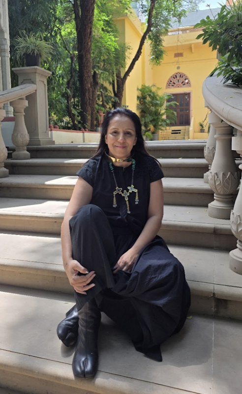
Near Earth Object, founded and creatively helmed by Kanica and Vaibhav, belongs firmly to the second category. Sculptural, celestial and deliberately unconventional, nEo approaches jewellery less as adornment and more as a language, one that speaks through proportion, metal, movement and presence.
The name itself captures the tension at the heart of the brand. A near-Earth object exists somewhere in the vastness of space, yet comes close enough to form a relationship with us. For Kanica , jewellery occupies much the same space: otherworldly in its imagination, but intensely intimate once it meets the human body
“I never wanted to build just a jewellery label,” Kanica says. “I wanted to build a language, a world in which an object worn on the body could express something before the person even spoke.”
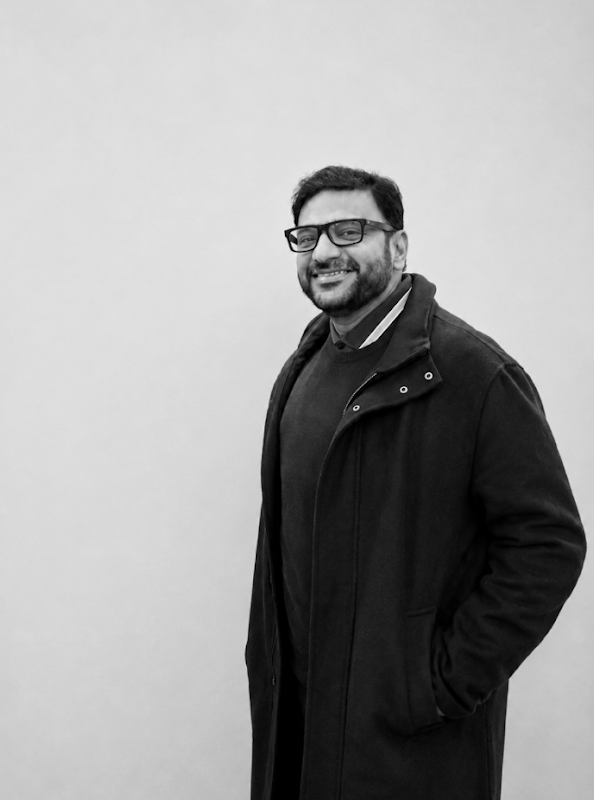
That world was built around one central idea: freedom.
Freedom from conventional femininity. Freedom from occasion dressing. Freedom from the expectation that jewellery must be delicate, flattering or familiar. And perhaps most importantly, freedom from permission. For decades, jewellery has existed within a fairly predictable vocabulary. There are pieces for weddings, pieces for evenings, pieces for everyday wear. There are rules around scale, femininity, proportion and what is considered flattering. nEo isn't particularly interested in any of them
“I wanted to liberate jewellery from permission,” Kanica says. “From the idea that a woman needs an occasion, a certain outfit, a certain age, a certain body or someone else’s approval to wear something powerful.” That philosophy has become the foundation of the brand's identity.
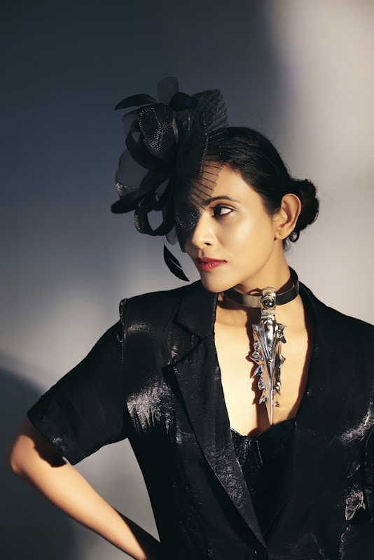
The nEo woman isn't a demographic so much as an attitude. She can be quiet or theatrical, minimal or maximal, feminine, masculine or fluid. What connects her is self-possession.
“She does not wear a statement piece to attract attention; she wears it because it feels true to her,” Kanica explains. “She is curious, independent and comfortable being difficult to categorise.”
In fact, Kanica doesn't believe someone becomes an nEo woman by wearing the brand. “She already is one.” It is a subtle but important distinction. nEo isn't selling transformation. It is offering a physical vocabulary for something that already exists within the wearer. The visual language of nEo begins with form rather than ornament.
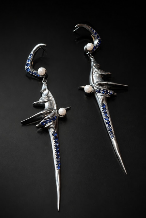
The founders draw inspiration from orbit, erosion, fragments, impact, metal, celestial movement and the strange geometry of things found in nature and space. Their pieces can feel almost archaeological, like objects that have travelled through another world before arriving on the body. “I like pieces that feel discovered rather than decorated,” she says. “Almost like an object with its own history.” That distinction explains much of what makes nEo feel different. The jewellery isn't designed simply to sit on the body. It interacts with it.
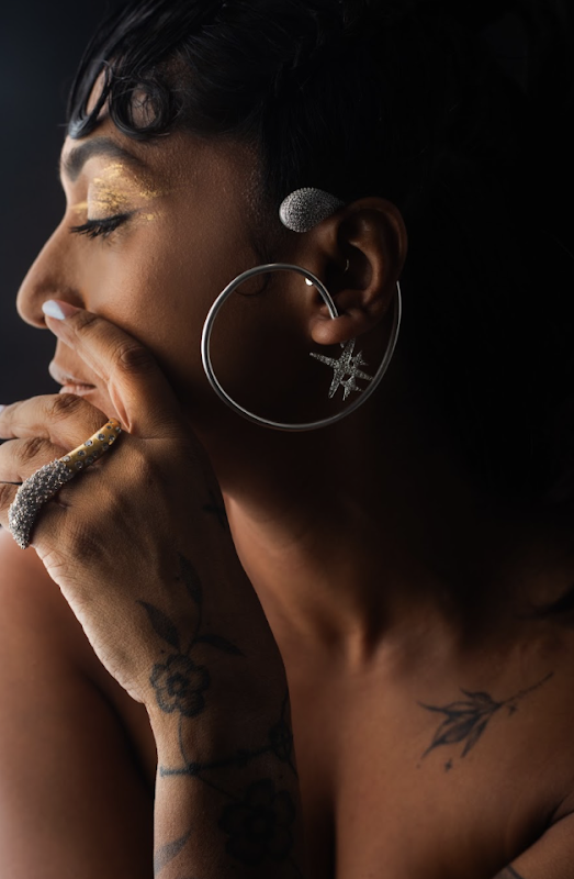
The body becomes part of the sculpture. A collar can alter the architecture of a silhouette. An ear cuff can extend the shape of the face. A ring can become an interruption rather than an embellishment. Jewellery becomes something closer to wearable architecture: a physical extension of identity. And importantly, they don't begin with a customer profile.
“Usually an emotion or an image arrives first, and then I try to find its physical form,” Vaibhav says. “I do not begin by imagining a ‘customer profile’ because that can make a piece too obedient.” Instead, the object comes first. The wearer completes it.
This is perhaps where nEo's approach to luxury becomes particularly contemporary. The value of a piece isn't necessarily in its ability to communicate status. It lies in its ability to communicate self.
“A piece can be precious without being polite,” Vaibhav says. It can be emotional, confrontational, humorous, protective or strange. For nEo, jewellery isn't necessarily the finishing touch. “Very often, it is the beginning of the person you decide to be that day.”
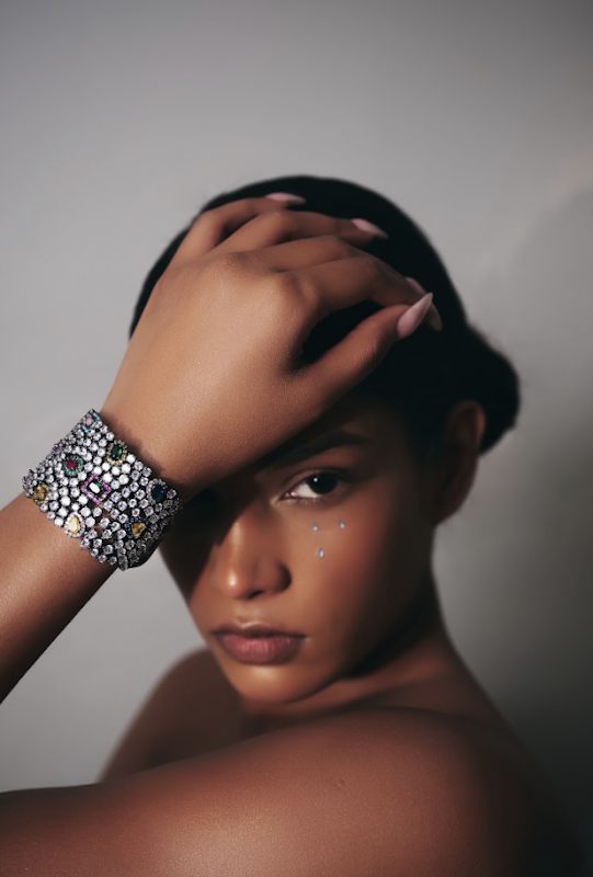
Fashion has spent decades teaching women how to make themselves more visually acceptable. More flattering. More elongated. More delicate. Smaller.
nEo asks a different question: what if we stopped designing around what makes the body look smaller and started designing around what makes it feel more powerful?
“We get much more interesting women, and much more interesting design,” Kanica says. That shift is visible in the brand's relationship with proportion. Forms exaggerate. Pieces extend, wrap, interrupt and frame the body. Metal can become armour. Asymmetry becomes deliberate. Scale becomes expressive.
“‘Flattering’ often means visually reducing, correcting or making the body easier for someone else to consume,” she explains. “Power gives us a different question: what makes you feel more like yourself?”
It is a philosophy that feels increasingly aligned with the way Indian women are dressing today. Kanica has noticed a growing confidence in mixing references, repeating outfits, wearing jewellery unexpectedly, choosing comfort and rejecting the idea of a single correct feminine aesthetic. Indian women, she believes, have always been expressive. What has changed is the permission to make that expression visibly personal.
Remove symmetry, perfection and convention from the conversation around beauty and something more interesting emerges. For Kanica , beauty becomes energy. It can exist in imbalance, texture, distortion, age, contradiction and things that remain slightly unresolved. “I am often more attracted to a form that makes me look twice than one that is immediately perfect,” she says. That philosophy runs through nEo's universe. The pieces aren't trying to be universally pretty. They are trying to be memorable.
Because perhaps the most interesting objects aren't the ones you understand instantly. They are the ones that make you look again. It was perhaps inevitable that nEo would eventually move beyond jewellery. The brand has expanded into clothing and prêt, but Kanica doesn't view this as conventional category expansion. Once nEo became a language of identity, clothing became another way of speaking it. Silhouette, movement, texture and layering create the atmosphere around the jewellery. “It's not expansion for the sake of categories,” she says. “It is the same idea finding new forms.” The consistency isn't literal. Not everything needs to look cosmic. Instead, every object must pass through the same emotional filter: independence, tension between rawness and refinement, movement, strength, space and unexpected proportion. Whether it is a collar, a ring or a garment, it should feel as though it belongs to someone who isn't asking permission to be seen. That philosophy extends into the physical world too.
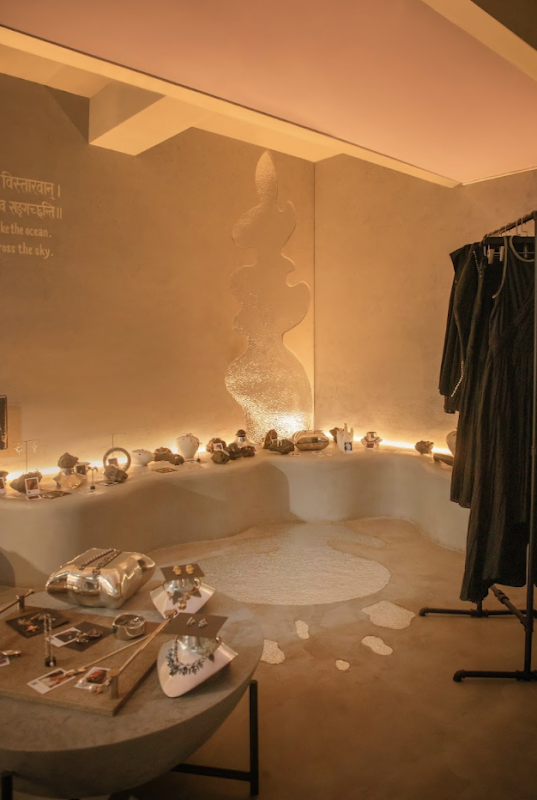
nEo's Greater Kailash-2 store was conceived as a sculptural, celestial and intimate environment, less conventional jewellery boutique, more private installation. Kanica wanted people to slow down. To touch things. To discover them. To experiment without judgement. The imagined nEo universe has a soundtrack of atmospheric electronic music with a deep pulse, lighting that moves from the final warmth of sunset into blue-black night, and a scent that is mineral, smoky and slightly metallic, softened by something warm and skin-like.
Familiar for a second. Completely unknown the next. For all its futuristic language, nEo is unmistakably Indian in its origin. But Kanica isn't interested in translating Indianness into predictable motifs. “I think about an international state of mind more than an international woman,” she says.
India's relationship with jewellery, ornament, material and craftsmanship inevitably informs the brand. But rather than reproducing tradition literally, nEo absorbs those influences and pushes them somewhere unexpected.
That, Vaibhav believes, is where Indian design is becoming increasingly powerful globally.
Indian brands are becoming less interested in explaining themselves through clichés and more willing to present a distinct point of view on their own terms.
The opportunity, she believes, lies in identity-led luxury.
Consumers increasingly want pieces that are recognisable because of design rather than simply because of a logo. An Indian brand can bring centuries of material intelligence and craftsmanship to the table while still speaking a futuristic, global language.
The shift is significant: from Indian, therefore traditional to Indian, therefore capable of imagining something entirely new.
A strong point of view comes with a price.
There have inevitably been moments when nEo's designs could have been softened, simplified or made more commercially accessible. But Vaibhav has learned not to mistake discomfort for failure. “‘Too much’ is usually the first response to something before it becomes familiar,” he says. For a brand built on liberation, diluting the design language for mass approval would ultimately defeat the purpose. It is tempting to make something safer because safer can be easier to sell.
But nEo becomes less meaningful when its tension, scale and point of view disappear.
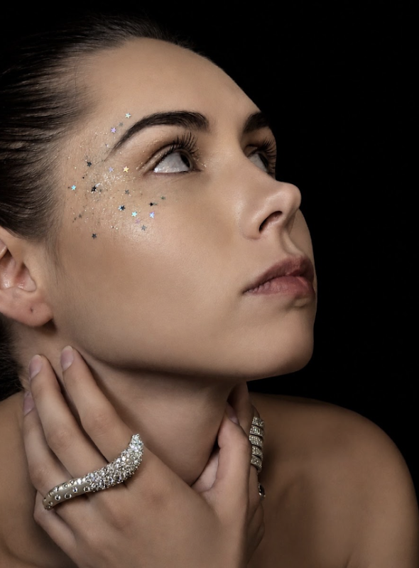
“I would rather grow with a clear identity than grow faster by becoming visually interchangeable.” That might be one of the most difficult decisions for an independent luxury brand: choosing distinction over immediate universality.
But it is also where brands become memorable. Behind the striking objects and carefully constructed universe is, of course, the less glamorous reality of entrepreneurship.
From the outside, building a creative brand can look like one great idea followed by momentum. From the inside, Kanica says, it is hundreds of small decisions. Systems. Operations. Sales. Problems. Rejections. Commercial compromises. And the constant challenge of protecting the original instinct while building a business capable of sustaining it. For the founders, the solution is to give creativity a space where it doesn't immediately have to justify itself. “If every idea is judged by a sales spreadsheet at birth, it will never become strange enough to be interesting.” The business, in their view, should create a structure strong enough to protect creative risk, not eliminate it. That may be the real discipline behind nEo's fearlessness.Not having no doubt. Knowing when not to let doubt make the decision.
Ask Kanica what she wants people to remember about nEo ten years from now and the answer isn't a particular collection or silhouette. It is permission. “I would love for the brand to be remembered not only for a particular silhouette or collection, but for shifting the emotional role of jewellery from decoration to expression.” The ambition is to create such a distinct visual language that the feeling of an nEo piece becomes recognisable before the name does.
And then comes the final thought, the one that perhaps explains the entire universe better than anything else:
are the galaxy because you were never meant to be reduced to one role, one shape, one version of beauty or one way of being seen.
You contain contradictions. Darkness and light. Impact and stillness. Orbit and infinite possibility. nEo simply gives some of that universe a physical form.